


If you’ve been paying even a smidgeon of attention to the world of interior design, you’d know that brown is having a moment. It’s been quietly gaining popularity for a year or two, but some of us believe it never really went away. The truth is, brown is having its time in the spotlight, but unlike more polarizing colours like purple, it feels like a bit of a stretch to call such a versatile and neutral shade a “trend.”
The newfound love for brown might be attributed to the tactile and warm approach to minimalism known as ‘soulful minimalism’, where the cool tones and sharp lines of the past are giving way to natural materials, textures, and a neutral colour palette featuring warm whites, browns, and greens. Alternatively, the resurgence of the 1970s aesthetic in interior design could be fueling brown’s popularity, without the gaudy shag carpets and garish orange prints. Think more along the lines of tan leather furniture, rich brown velvet, subtle abstract art, and the elegant style of Yves Saint Laurent’s Paris apartment.
Overwhelmingly positive
We conducted a social media poll to gauge public opinion on the current ‘it’ colour, and the feedback was overwhelmingly positive. Many sang praises for brown, describing it as “cool,” “cozy,” “earthy,” and “inviting.” However, some detractors couldn’t help but draw a less glamorous comparison, likening the colour to the contents of a nappy. Others felt it dredged up memories of their parents’ home decor from the ’70s and ’80s. Some simply found it too dark and “boring.” But, don’t be put off, because long after the brown craze subsides, it will remain a timeless choice. The secret to making brown work is all about how you use it.
How to get the most from brown
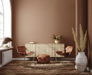
Firstly, consider the size of the room you’re decorating. In a large space with high ceilings, you can incorporate a lot of the colour without it feeling overwhelming. However, in smaller, average-ceilinged rooms without grand architectural features, a dark brown can feel oppressive. In smaller spaces, it’s better to use brown in moderation, perhaps in the form of cushions, footstools, artwork, or antique furniture. If you’re uncertain, lean towards lighter shades of caramel and tobacco.
When it comes to fabric, consider plain cotton velvets for curtains or natural fabrics. African cloths, like hand-stitched Kuba cloth, offer another way to introduce the trend in a manner that’s interesting and tactile without looking overtly trend-driven.
Mixing various shades of can be tricky, so it’s generally more palatable to pair brown with complementary colours such as red or yellow-based whites, dusky pink, lighter to mid-blue, or pistachio and sage green. These combinations not only look chic with brown but also uplift it, preventing it from feeling dull and dowdy.
If you’re thinking of painting your walls brown, be bold and consider teak panelling for a warm and inviting atmosphere. For brown wallpaper, opt for contemporary designs rather than retro prints. Many brown paint colours are available, ranging from gently purple-based dark ones to darker red-leaning browns and lighter tobacco tones.
Let’s talk about furniture

Dark wood, often referred to as brown furniture, is a winning choice. You can find these mostly antique pieces at a bargain because they tend to be overshadowed by the crowd rushing to buy lighter oak and beech. What sets brown furniture apart isn’t just its affordability; it’s the honesty, character, and the captivating patina or intriguing signs of life that breathe depth into rooms that might otherwise feel overly pristine and shiny-new.
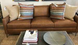
Brown furniture isn’t limited to wooden pieces; it can also encompass sofas or armchairs. Interior stylist and consultant Gillian Lawlee wisely suggests that if you find the idea of brown fabric upholstery intimidating or fear that it might turn out to be a fleeting trend, you should consider tan or brown leather. Natural leather is a timeless neutral that effortlessly complements any decor and should be regarded differently from brown-coloured fabric.
Concerning painting your walls in brown

Painting in the colour might initially feel daunting. The good news is that it’s not all about chocolate and cola shades. A variety of gentle, nearly neutral browns are making a resurgence in the chicest interior designs. These hues might be likened to ‘tobacco’ colours, with options such as Paint & Paper Library’s ‘Caddie’ proving a long-standing favourite. They also invite comparisons to delectable coffee shop descriptions like caramel, latte, or biscuit. Little Greene’s recent collection, ‘Sweet Treats,’ introduces a range of brown shades with names like ‘Ganache,’ ‘Affogato,’ ‘Bombolone,’ and the delightful warm golden brown of ‘Madeleine.’
These lighter shades evoke the world of cakes and biscuits, far removed from the dated aesthetics of the 1970s. “Biscuit tones” are the ideal mid-neutral. They add warmth to any scheme that requires more than plain white without overwhelming it with excessive colour.
As we venture a shade or two away from gold towards brown, we enter the realm of coffee-inspired shades. Use these shades as an alternative to white trims against softly nuanced wall colours. They frame your walls cleverly, particularly in smaller rooms. These shades easily complement block-printed linens and weaves, ranging from deep greens to romantic rose pinks, giving your space a vibrant, stylish aura.